Overview of the dashboards
Defastra provides you with 2 dashboards: one providing you valuable fraud prevent insights, and one for monitoring your usage & spending.
The Fraud prevention dashboard comes with the possibility to filter and group by time-period. Here are the available time filters:
- Last 30 days of data, grouped by day
- Last 15 days of data, grouped by hour
- Last 3 days of data, grouped by minute
- Last 24 hours of data, grouped by 10-second
The data are all in real-time and refreshed once per minute.
Usage & spending dashboard
This dashboard allows you to track your spending and usage.
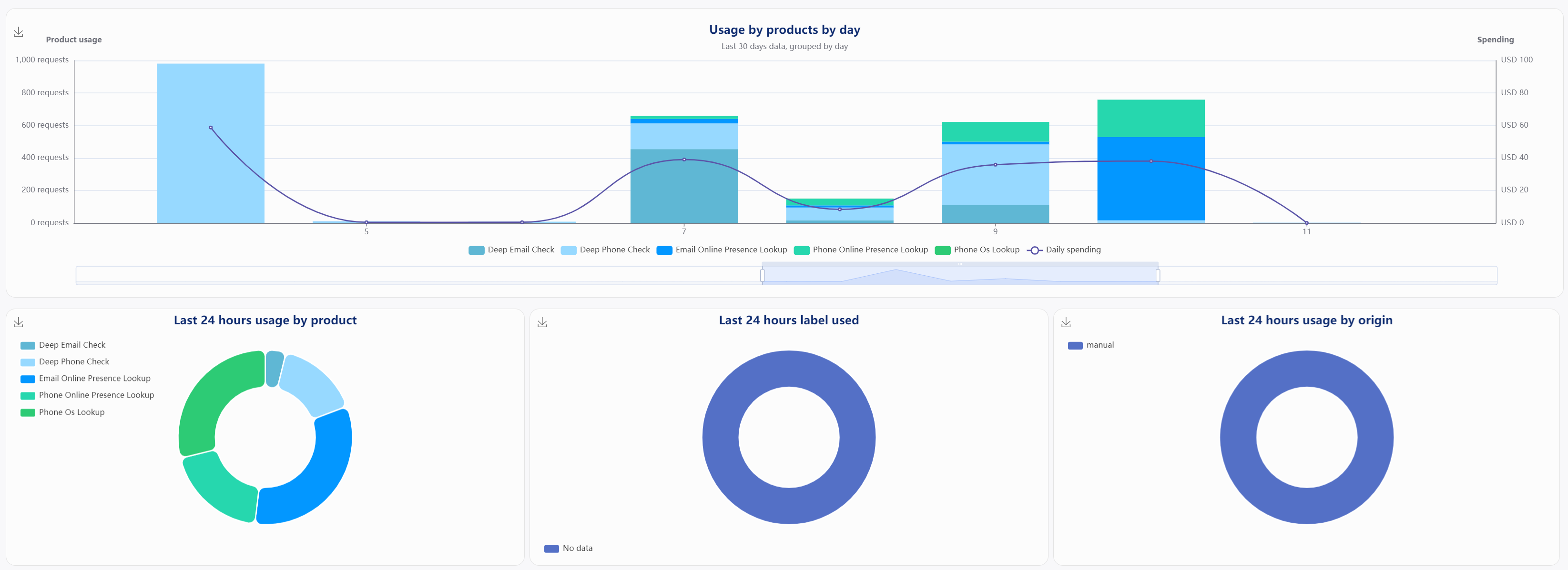
Main usage & spending charts.
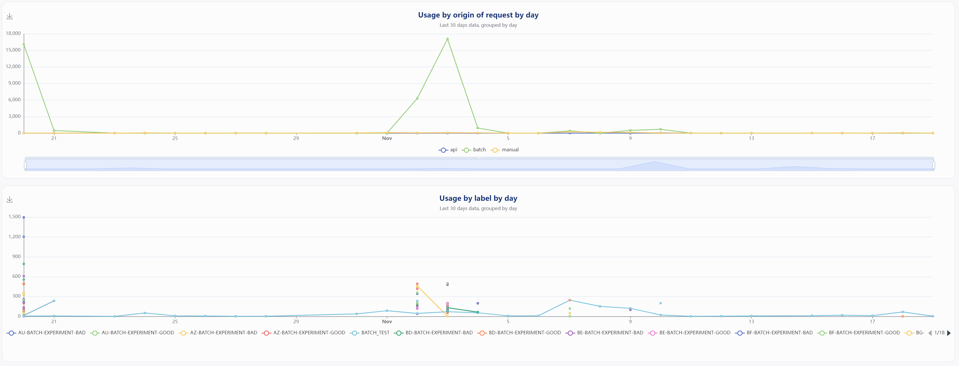
Usage broke down by origin (such as batch or API), and broke down by label.
Important
If you are a team administrator, note that any usage of your team members will also be included in those charts. As the team administrator, all team usage is funneled through your account.
Fraud prevention dashboard
The data in this dashboard comes from your usage of the Deep Checks products. It allows you to easily monitor what kind of threats are detected, from where they come, as well as understanding your customers social footprints.
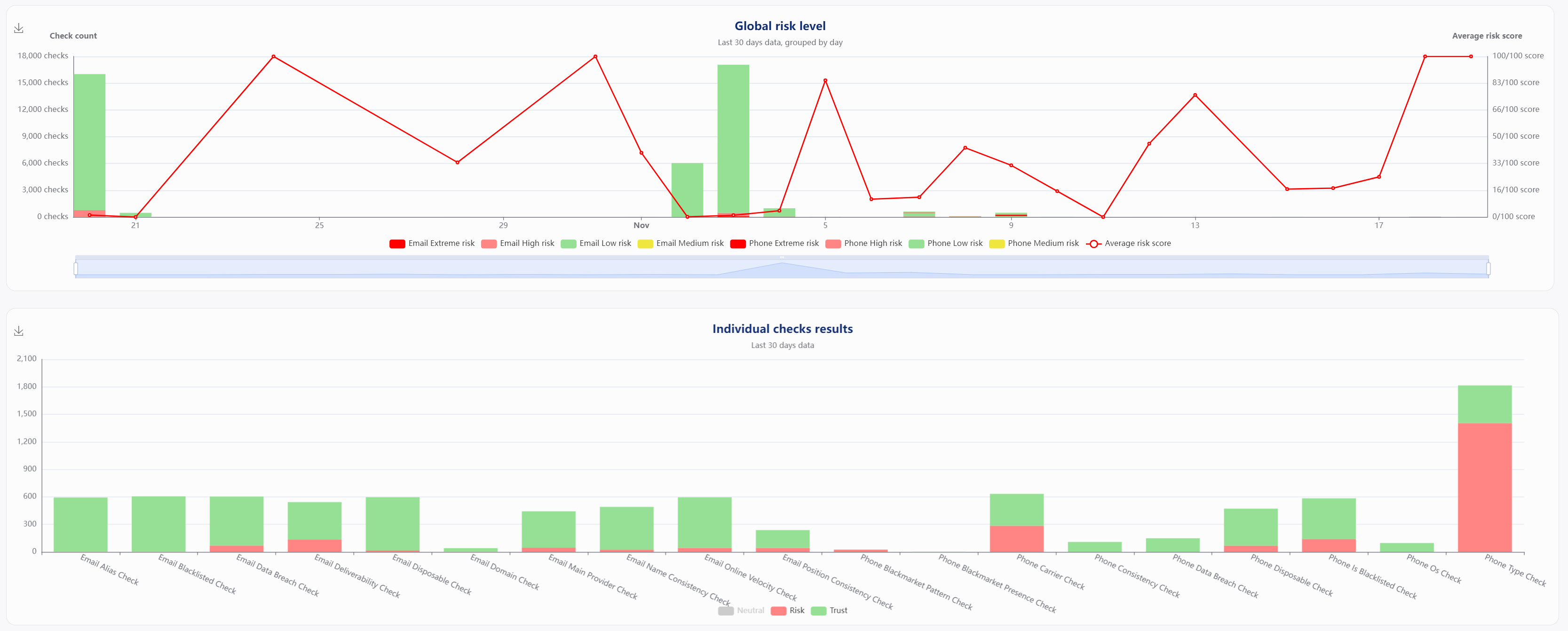
Global risk level and Individual checks results
Those charts summarize the risk level of your submitted phone numbers and email addresses and the outcome of each check performed during our analysis. For more information about individual checks, click here.

This map shows you an in-depth view of the average risk score per carrier, per OS, and country.
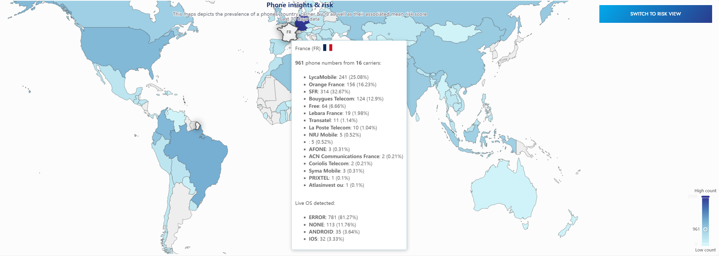
By switching to the proportion view, you will get details about the volume of phone numbers per country, carrier & live OS detected.
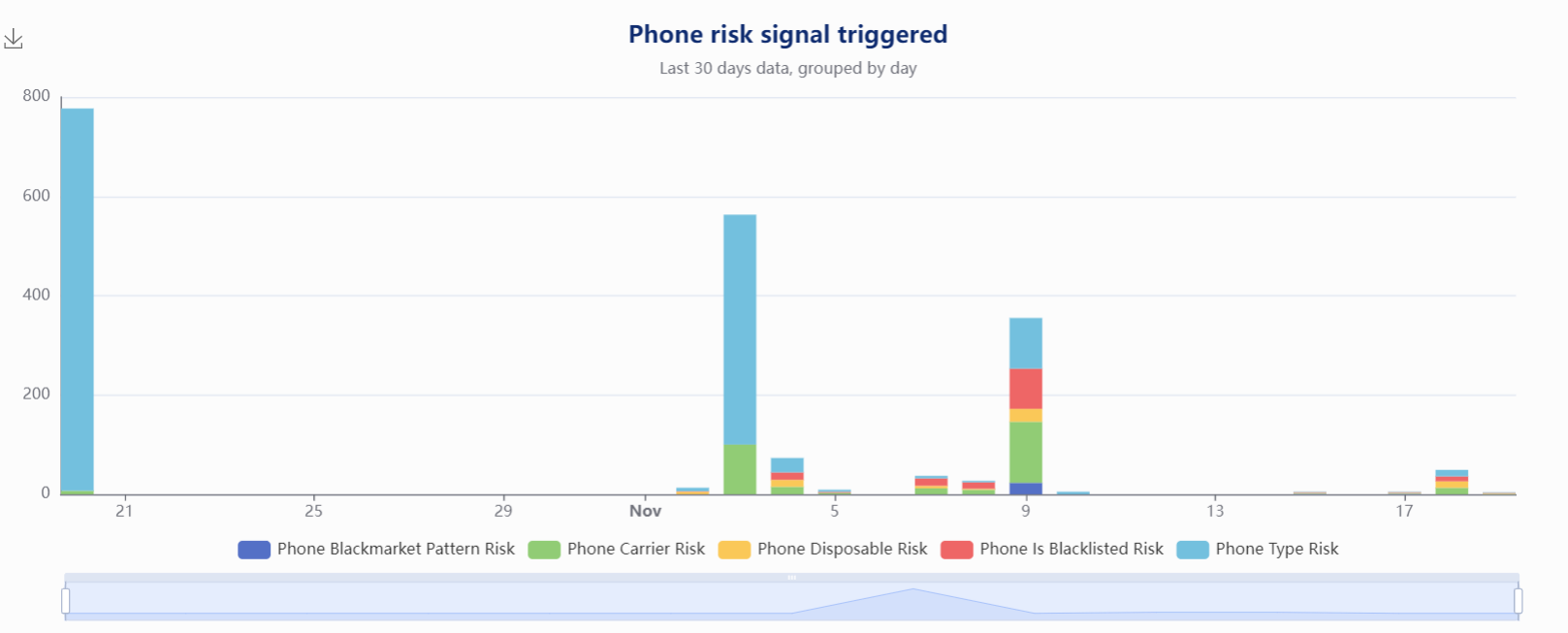
This chart shows you what risk signals were uncovered. It is useful to keep track of what kind of threats are detected. This chart is available for phone and email.
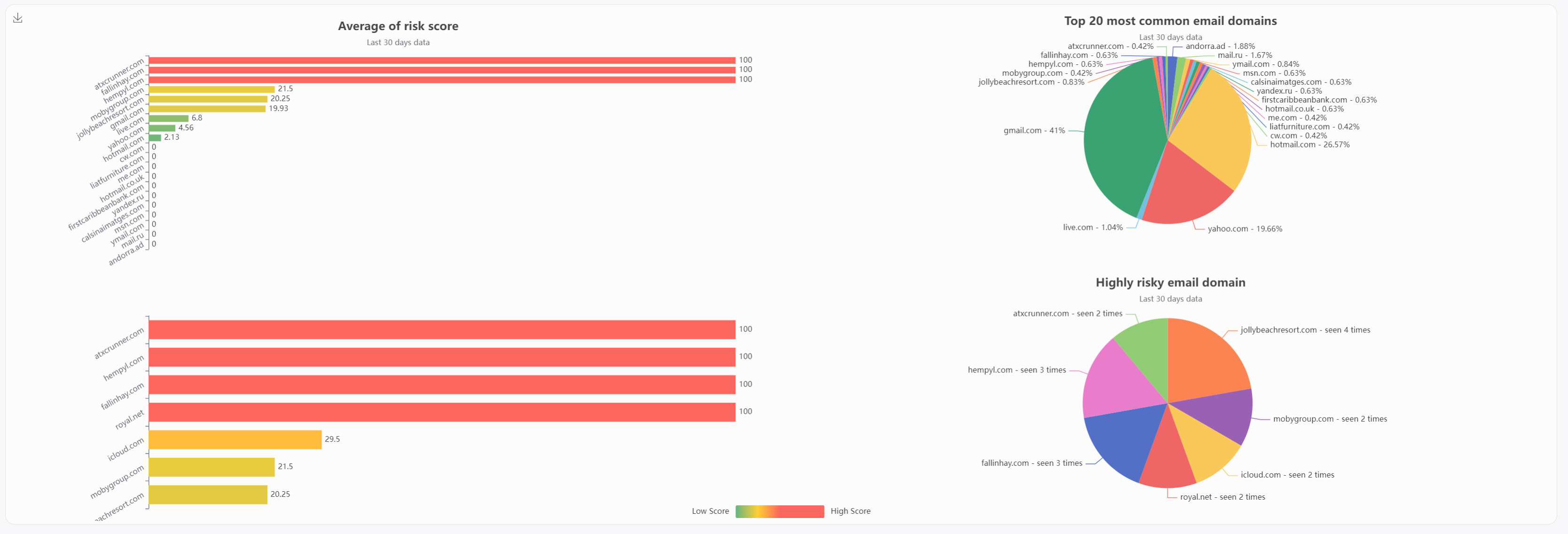
This chart displays the most common email domain received by your Deep Email Checks, and their associated average risk score. The secondary part of the chart shows us the top risky domain (score above 25), and their proportion.

Those charts show the average amount of profiles found when performing a deep check, and the average data breach involvement.
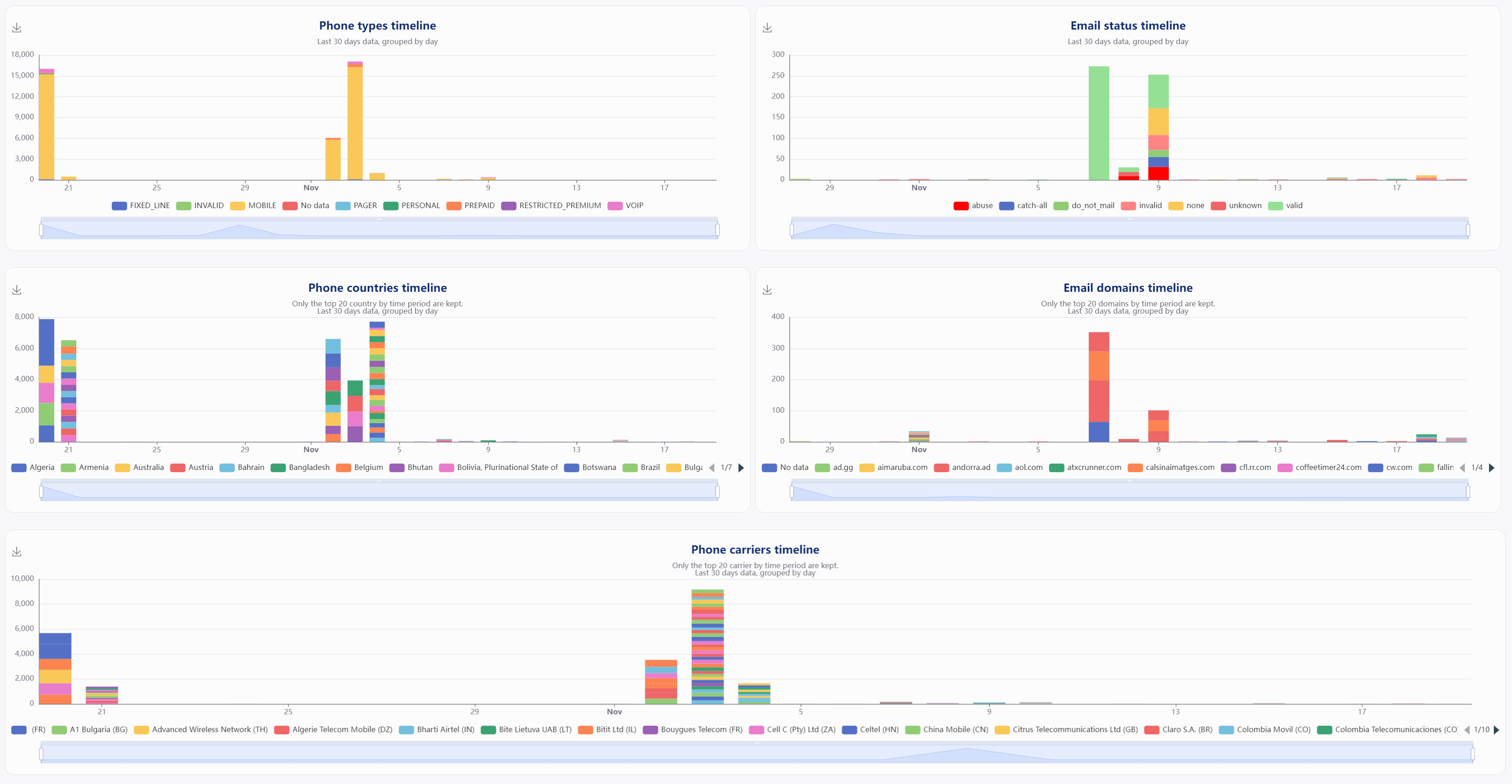
Timeline charts
You will have various timelines charts. They break down your data by time-period (down to 10-seconds, as seen in the introduction), and allow you to have a crystal clear view of what kind of email addresses & phone numbers you submit.
Data enrichment charts
Various charts are here to help you understand the social presence of your users.
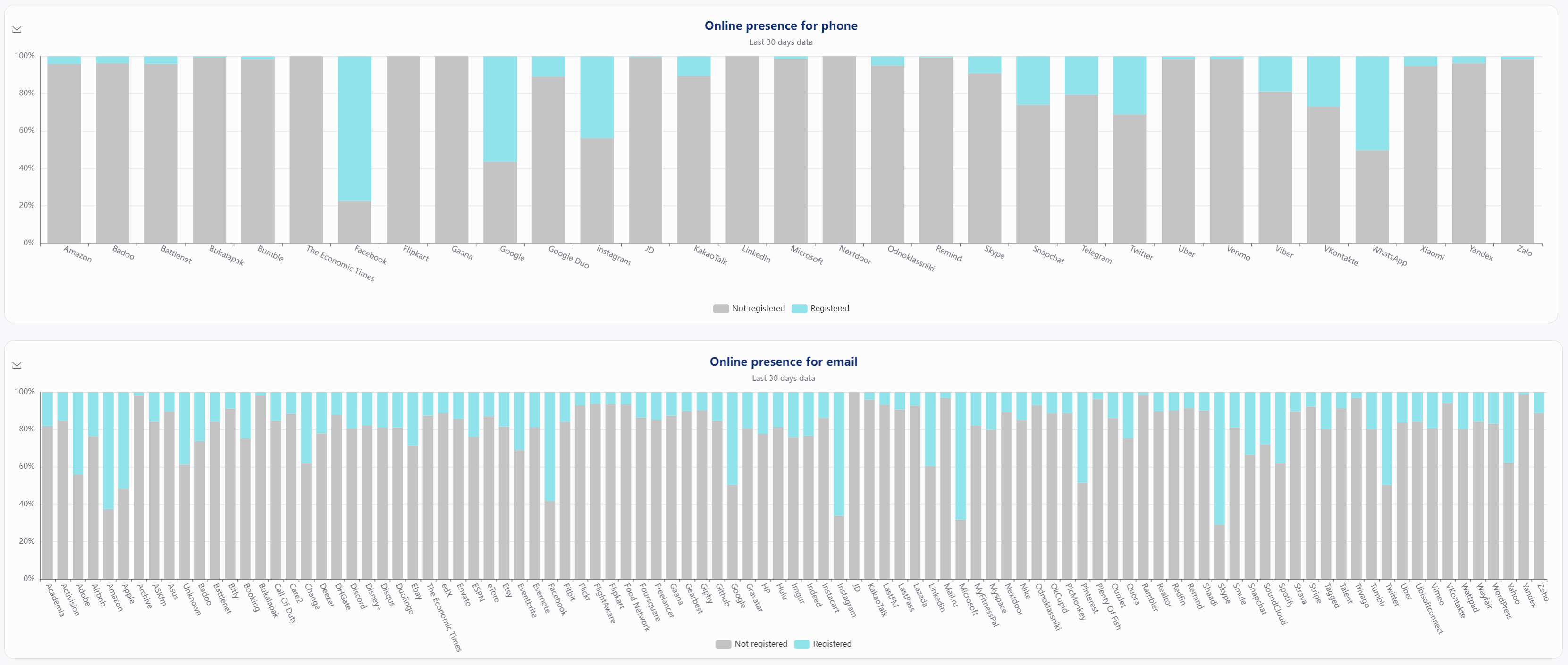
Those charts depict the percentage of profiles found per service.

Social footprint map
This map shows you where your users are, based on their email or phone social footprint: the sole source of data for this map is the countries found to be linked to your users' online profiles (for example, the country found linked to your users' Skype profile).

This chart shows you the most common email domain you submitted and their average of profiles found. Below is a chart showing the most common phone numbers' countries and their average of profiles found.
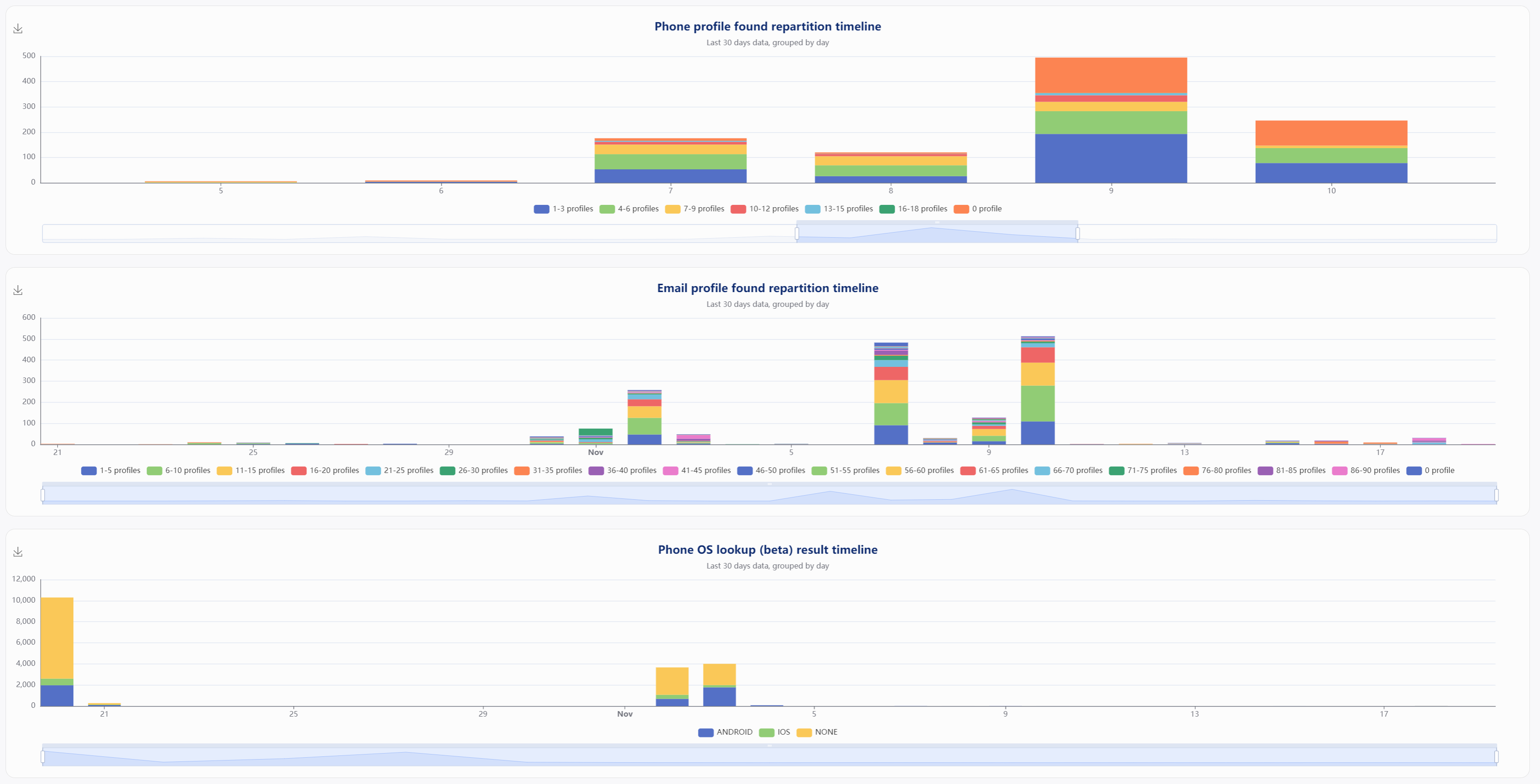
Finally, you will have various timelines charts. They break down your data by time-period (down to 10-seconds, as seen in the introduction).
Updated over 3 years ago
